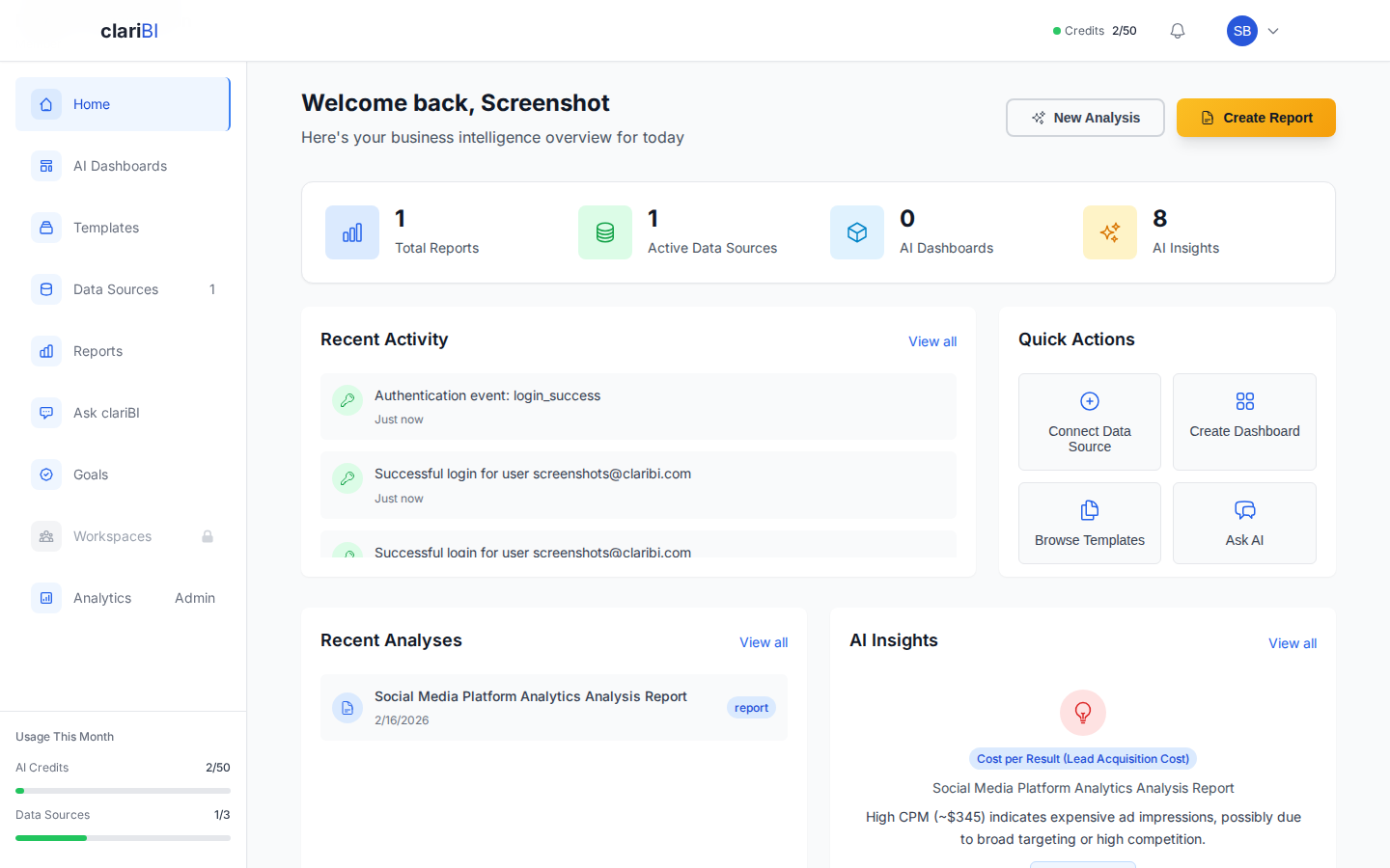
The Home Dashboard at a Glance
The Home Dashboard is the first screen you see after logging in. It is designed to give you a rapid status check across your entire analytics environment -- data health, recent activity, AI insights, and quick shortcuts to common tasks.
This article covers every section from top to bottom.
Top Stats Bar
The stats bar sits at the top of the Home Dashboard and displays four key metrics:
Total Data Sources
Shows the number of connected and active data sources. A green dot means the source synced successfully on its last run. A yellow dot means a sync is in progress. A red dot means the last sync failed.
Click the number to jump directly to the Data Sources management page.
AI Credits Remaining
Displays how many AI credits you have left in your current billing cycle. Credits reset on your monthly billing date. If you are on the Trial plan, you start with 50 credits.
| Plan | Monthly Credits |
|---|---|
| Trial | 50 |
| Starter | 500 |
| Professional | 1,500 |
| Enterprise | 5,000 |
Reports Generated
A running count of reports created this month. This includes both manually generated reports and those produced by scheduled automations.
Active Dashboards
The number of dashboards currently in your workspace that are not archived.
Welcome Card and Onboarding Progress
If you are within your first week, a welcome card appears below the stats bar. It tracks your onboarding checklist:
- Connect your first data source
- Run your first AI analysis
- Create a dashboard
- Invite a team member (Starter plan and above)
- Set up a scheduled report
Each completed task shows a checkmark. Once all tasks are done, or after seven days, the card disappears automatically. You can also dismiss it early by clicking the X in the top-right corner.
Quick Actions Panel
The Quick Actions panel gives you one-click access to the tasks you perform most often:
- New Dashboard -- opens the dashboard builder
- New Report -- opens the report generator
- Ask AI -- opens the conversational analytics interface
- Connect Data -- opens the data source connection wizard
- Invite Team -- opens the team invitation modal (available on Starter and above)
These actions are always available regardless of your plan tier, though some (like Invite Team) may prompt an upgrade if your plan does not support them.
Recent Activity Feed
The activity feed shows the latest events across your organization, ordered newest first:
- Analysis completed -- someone ran an AI analysis
- Report generated -- a report was created or scheduled
- Data source synced -- a source completed its sync cycle
- Dashboard updated -- a dashboard was modified
- Team member joined -- a new user accepted an invitation
Each entry shows the user who performed the action, a timestamp, and a brief description. Click any entry to navigate to the relevant item.
Filtering the Activity Feed
Use the filter dropdown above the feed to narrow events by type (analyses, reports, syncs, dashboards) or by team member. This is especially useful in organizations with many active users.
Data Source Status
This section shows a compact status table of all connected data sources:
| Column | What It Shows |
|---|---|
| Name | The data source display name you set during connection |
| Type | Database, file, API, or cloud service |
| Status | Connected, syncing, error, or paused |
| Last Sync | Timestamp of the most recent successful sync |
| Records | Approximate row count from the last sync |
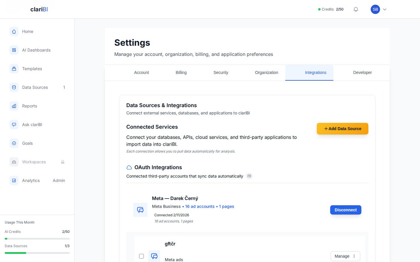
Red-status sources have a Retry button. Click it to trigger an immediate re-sync. For persistent errors, see Data Source Errors: Every Error Message and How to Fix It.
Recent Dashboards and Reports
Below the data health section, two side-by-side cards show your most recently viewed dashboards and reports:
- Recent Dashboards -- the last five dashboards you opened, with a thumbnail preview and last-modified timestamp.
- Recent Reports -- the last five reports you generated, with the report title and creation date.
Click any item to open it directly.
Customizing the Home Dashboard
While the Home Dashboard layout is not drag-and-drop customizable (that feature is for your custom dashboards), you can control what appears:
- Dismiss the welcome card after completing onboarding.
- Collapse sections by clicking the section header chevron. Collapsed state persists across sessions.
- Pin a custom dashboard as default -- in any dashboard's settings, toggle "Set as default view" to land on that dashboard instead of Home when you log in.
Tips for Getting the Most from Home
- Check data source status first. A quick glance at the status section tells you whether your data is current before you start analyzing.
- Use Quick Actions. They save two or three clicks compared to navigating through the sidebar.
- Bookmark the activity feed filter for your name to see your own recent work.