Interface Overview
The clariBI interface follows a standard three-region layout:
- Sidebar (left) -- primary navigation
- Header bar (top) -- search, notifications, and account menu
- Main content area (center) -- the active page
On screens narrower than 1024 pixels, the sidebar collapses into a hamburger menu. On mobile devices (under 640 pixels), the layout switches to a single-column view with a bottom navigation bar.
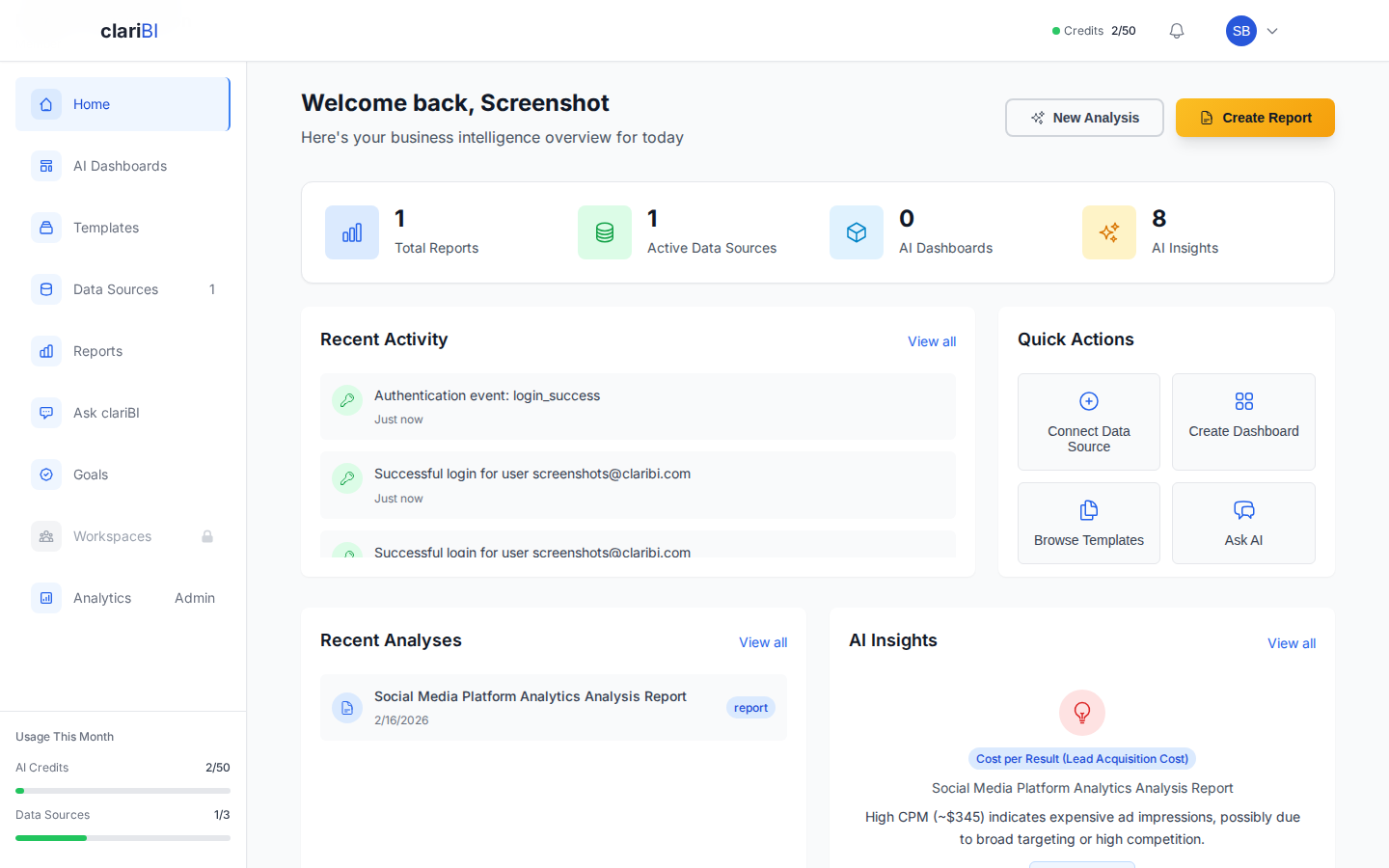
The Sidebar
The sidebar is your primary navigation tool. It is always visible on desktop and contains the following sections, listed from top to bottom.
Organization Selector
At the very top of the sidebar you see your organization name and logo. If you belong to multiple organizations, click the name to open a dropdown and switch between them. Switching organizations reloads the dashboard and data context.
Main Navigation Links
| Link | Where It Goes |
|---|---|
| Home | The Home Dashboard with stats, activity, and insights |
| Dashboards | List of all dashboards in the current workspace |
| Reports | List of generated and scheduled reports |
| Data Sources | Manage connected databases, files, and APIs |
| AI Analytics | Conversational analytics chat interface |
| Goals | Goal tracking and progress monitoring |
Each link shows an icon and a text label. The currently active section is highlighted with a colored accent bar on the left edge.
Workspace Section
Below the main links, the sidebar shows your workspaces. Workspaces are shared containers for dashboards, reports, and analyses. Click a workspace name to filter the view to that workspace's content.
You can create a new workspace by clicking the + button next to the "Workspaces" heading. For details on workspace management, see Workspaces: Creating, Configuring, Managing.
Settings and Account
At the bottom of the sidebar:
- Settings -- opens the settings panel with tabs for Profile, Organization, Security, Billing, API Keys, and Team Management.
- Help -- opens this Knowledge Base in a new tab.
- Collapse toggle -- the chevron at the very bottom collapses the sidebar to icon-only mode, giving more room to the main content area.
Collapsed Sidebar Mode
Click the collapse toggle to minimize the sidebar to a narrow icon strip. Hover over any icon to see a tooltip with the section name. Click the expand toggle to restore the full sidebar.
Collapsed state persists across sessions -- if you collapse it, it stays collapsed the next time you log in.
The Header Bar
The header bar spans the top of the main content area and contains:
Search
The search field (or press / to focus it) searches across dashboards, reports, data sources, and knowledge base articles. Results appear in a dropdown as you type, grouped by type.
Notifications Bell
The bell icon shows a badge with the count of unread notifications. Click it to open the notification panel. Notification types include:
- Data source sync completions and failures
- Scheduled report delivery confirmations
- Team member activity (joins, role changes)
- AI analysis completions
- System alerts (credit limits, plan expiration)
Notifications are delivered in real time via WebSocket. You can mark individual notifications as read or click Mark All Read.
Account Menu
Your avatar (or initials) on the far right opens the account dropdown:
- My Profile -- view and edit your profile settings
- Security -- manage MFA, sessions, and password
- Billing -- view your plan and manage subscription
- Sign Out -- log out of the current session
The Main Content Area
The main content area displays the page you navigated to. Most pages follow a consistent structure:
Breadcrumbs
A breadcrumb trail at the top of the page shows your current location in the hierarchy. For example: Home > Dashboards > Q4 Sales Overview. Click any segment to jump back to that level.
Page Header
Below the breadcrumbs, the page header includes:
- The page title
- Action buttons relevant to the current page (e.g., "New Dashboard", "Run Analysis", "Export")
- Filter controls where applicable
Content Body
The main content varies by page. Dashboards show a widget grid. Reports show formatted content. Data Sources shows a management table. AI Analytics shows the chat interface.
Contextual Help
Many pages include a small ? icon in the page header. Clicking it opens a brief help tooltip or links to the relevant Knowledge Base article.
Mobile Navigation
On mobile devices (screen width under 640 pixels), the interface adapts:
Bottom Navigation Bar
The sidebar is replaced by a fixed bottom bar with five icons:
- Home -- Home Dashboard
- Dashboards -- Dashboard list
- AI -- Conversational analytics
- Reports -- Report list
- More -- opens a slide-up menu with Data Sources, Goals, Settings, and Help
Slide-Up Menu
Tapping More in the bottom bar opens a half-screen panel with additional navigation options and your account menu. Swipe down or tap outside the panel to close it.
Tablet Layout (640px to 1024px)
On tablets in landscape mode, the sidebar appears in collapsed (icon-only) mode by default. You can expand it temporarily by tapping the hamburger icon. The expanded sidebar overlays the content rather than pushing it aside.
Customizing Your Navigation
Reorder Sidebar Items
Currently, sidebar ordering is fixed and follows the sequence listed above. Custom ordering is planned for a future release.
Default Landing Page
By default, logging in takes you to the Home Dashboard. To change this, open any custom dashboard, click its settings gear, and enable Set as default view. Now logging in takes you directly to that dashboard.
Notification Preferences
To control which notifications appear (and how), go to Settings > Notifications. You can toggle each notification type on or off, and choose between in-app only or in-app plus email.
URL Structure
Understanding the URL structure helps you navigate directly and share specific pages:
| URL Pattern | Page |
|---|---|
/app/home |
Home Dashboard |
/app/dashboards |
Dashboard list |
/app/dashboards/{id} |
Specific dashboard |
/app/reports |
Report list |
/app/reports/{id} |
Specific report |
/app/data-sources |
Data source management |
/app/conversational-analytics |
AI chat interface |
/app/goals |
Goal tracking |
/app/settings |
Settings panel |
/app/settings/billing |
Billing settings |
/app/settings/security |
Security settings |
/app/settings/team |
Team management |
You can bookmark any of these URLs or share them with team members who have appropriate access.
Accessibility
clariBI follows standard web accessibility guidelines:
- All interactive elements are keyboard-reachable via Tab navigation.
- The sidebar and menus support arrow-key navigation.
- Color is never the only indicator -- status dots also use different shapes for colorblind users.
- Screen reader labels are applied to all icons and interactive elements.
- Minimum touch targets on mobile are 44x44 pixels.
- Focus outlines are visible on all interactive elements when navigating by keyboard.
- The interface supports browser zoom up to 200% without layout breakage.