Dashboard Builder
Estimated reading time: 15 minutes
The dashboard builder is where you design and configure your dashboards. This reference covers every feature of the builder interface.
Prerequisites
- A clariBI account with at least one connected data source
- Member role or higher (Viewers cannot create dashboards)
Opening the Builder
There are two ways to open the builder:
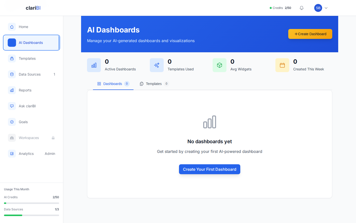
- New Dashboard: Go to Dashboards and click "Create Dashboard". You can start with a blank dashboard or select a template. The builder wizard opens.
- Edit Existing: Open a dashboard and click the "Edit" button in the top-right corner to modify its settings and widgets.
The Builder Wizard
The dashboard builder uses a guided 5-step wizard to help you create AI-powered dashboards:
Step 1: Data Sources
Select one or more connected data sources for your dashboard. You can combine data from databases, files, and API sources in a single dashboard.
Step 2: Business Domain
Choose the industry niche or business domain for your dashboard. This helps the AI recommend relevant metrics and chart types for your use case.
Step 3: Define Metrics
Select and customize the metrics you want to track. The AI pre-suggests relevant metrics based on your chosen domain and data sources. You can adjust, add, or remove metrics as needed.
Step 4: Design Layout
Arrange your dashboard widgets on a responsive 4-column grid. Set widget positions and sizes. The grid adapts to screen size automatically.
Step 5: Deploy
Name your dashboard, add a description, set the refresh frequency, and optionally share it with your workspace. Click Deploy to launch your dashboard.
Widgets and Metrics
How Widgets Are Created
In the builder wizard, widgets are generated from the metrics you define in Step 3. Each metric becomes a widget on your dashboard. The AI selects appropriate visualization types based on your data and domain:
- Metric Cards - for headline KPI numbers with trend indicators
- Bar Charts - for comparing values across categories
- Line Charts - for trends over time
- Pie Charts - for proportional breakdowns
- Tables - for detailed data exploration
- Gauges - for progress toward targets
Widget Display
Each widget shows:
- Title - the metric name displayed in the widget header
- Visualization - the AI-selected chart type with your data
- Trend Indicator - for metric cards, an up/down arrow showing change
- Data Source Info - which source(s) feed the widget
- Last Updated - timestamp of the most recent data refresh
You can also link any widget to a Business Goal to track progress directly from your dashboard.
Layout and Positioning
Grid Layout
Widgets are placed on a responsive grid. You can reposition widgets within the grid and adjust their column span. Widgets cannot overlap - the grid system keeps everything aligned.
Sizing
Each widget occupies one or more grid columns. Minimum size is 1 grid column wide and 1 row tall. Maximum width spans the full dashboard. Charts look best at 2-4 columns wide; KPI cards work well at 1-2 columns.
Responsive Behavior
The grid adapts to screen size. On desktop, you might have a 4-column layout. On tablets, it compresses to 2 columns. On phones, everything stacks to 1 column. You design at desktop width and the system handles the rest.
Widget Capacity
Each dashboard supports approximately 15-20 widgets depending on complexity. Widget types are grouped by complexity:
| Widget Category | Types | Complexity |
|---|---|---|
| Simple | Metric Card, Gauge, Bullet Chart | Low |
| Standard Charts | Bar, Pie, Line, Area, Funnel, Histogram, Radar, Waterfall | Medium |
| Advanced Charts | Scatter, Bubble, Treemap, Box Plot, Violin, Candlestick | High |
| Complex | Heatmap, Table, Sunburst, Sankey, Network Graph, Parallel Coordinates, Choropleth | Highest |
A dashboard of simple metric cards can fit more widgets than one composed of complex visualizations. The builder shows remaining capacity as you add widgets. If you exceed the limit, you will see a warning with options to remove another widget first.
Using AI Assistance
The builder's AI capabilities help at every step:
- In Step 2 (Business Domain), choosing the right domain helps the AI recommend the most relevant metrics for your industry.
- In Step 3 (Define Metrics), the AI pre-suggests metrics based on your data sources and domain. You can customize these or add your own.
- You can also use Conversational Analytics to explore your data first, then build a dashboard based on what you find.
- Start from a Template that matches your use case. Templates pre-fill the builder wizard with appropriate metrics and layouts.
Deploying Your Dashboard
In the final step, click Deploy to create your dashboard. The dashboard is immediately viewable by anyone with access. You will be redirected to the dashboard detail view.
If you want to experiment without affecting the live version, use the Duplicate option from the dashboard actions menu and edit the copy.
Pro Tip
Keep dashboards focused. A dashboard with 5-8 well-chosen widgets tells a clearer story than one with 20 widgets that require scrolling. Create separate dashboards for different aspects of your business.
No AI Credits? No Problem.
When you connect a data source, clariBI automatically generates a Data Insights dashboard with pre-computed charts - no AI credits needed. This is separate from the builder wizard and available on all plans, including Free.
Related
Ready to try clariBI?
Start your free 14-day trial. No credit card required.