Your CRM tracks sales pipeline. Google Analytics tracks website traffic. Your billing system tracks revenue. Your support platform tracks customer issues. Each system tells part of the story, but no single system tells the whole story. Multi-source dashboards bring data from these separate systems together into a single view so you can see relationships, identify patterns, and make decisions based on the complete picture. This tutorial walks through the entire process of building a multi-source dashboard in clariBI.
When You Need a Multi-Source Dashboard
Not every dashboard needs multiple data sources. A sales pipeline dashboard that only needs CRM data works fine with a single source. Multi-source dashboards are worth the additional setup when:
- The question spans systems. "How does website traffic relate to sales pipeline?" requires both analytics and CRM data.
- You need a unified customer view. Customer acquisition cost requires marketing spend (ad platforms), revenue (billing), and customer count (CRM).
- Executive dashboards need breadth. Leadership wants to see marketing, sales, product, and finance metrics in one place without switching between tools.
- Correlation analysis requires it. Understanding whether support ticket volume correlates with deployment dates requires data from your support platform and your deployment system.
Prerequisites
Before building a multi-source dashboard, make sure you have:
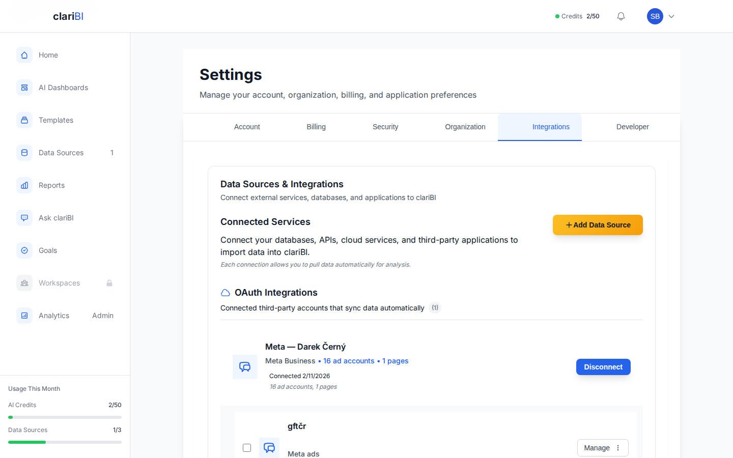
- Connected data sources. Each system you want to include must be configured as a data source in clariBI. Go to Settings > Data Sources to verify your connections. If a source is not yet connected, see the data source connection guide for setup instructions.
- Recent sync for each source. Check that each data source has synced recently so the dashboard reflects current data. The last sync timestamp is visible on the data sources management page.
- Clear metric definitions. Know what each metric means in each source system. "Revenue" in your billing system and "revenue" in your CRM may be calculated differently.
Step 1: Plan Your Dashboard
Before opening the dashboard builder, sketch the layout on paper or in a simple document. Answer these questions:
What Story Does This Dashboard Tell?
A good dashboard has a narrative. It answers a specific set of related questions in a logical order. An executive overview dashboard might follow this structure:
- Top row: Key business KPIs (revenue, customers, growth rate)
- Second row: Marketing performance (traffic, leads, conversion rate)
- Third row: Sales performance (pipeline, win rate, average deal size)
- Bottom row: Customer health (support tickets, churn rate, NPS)
Each row pulls from different data sources, but together they tell a coherent story about business performance.
Which Metrics From Which Sources?
Map each planned widget to its data source:
| Widget | Metric | Data Source |
|---|---|---|
| Revenue KPI | Monthly recurring revenue | Billing system |
| Customer count | Active customers | CRM |
| Website traffic | Sessions per month | Google Analytics |
| Lead count | New leads this month | CRM |
| Pipeline value | Open opportunity total | CRM |
| Support volume | Tickets opened this month | Support platform |
| Churn rate | Customers lost / total | Billing system |
This mapping ensures you know exactly what data you need and where it comes from before you start building.
Step 2: Create the Dashboard
Navigate to Dashboards from the sidebar and click + New Dashboard. Give it a descriptive name: "Executive Business Overview" is better than "Dashboard 1." Choose the workspace where you want it to live. If this dashboard will be shared with leadership, place it in a workspace they have access to.
You can also start from a template. The template marketplace includes multi-source templates designed for common use cases. Browse the marketplace, preview templates, and deploy one as a starting point if it matches your needs. See the template marketplace guide for browsing and deployment instructions.
Step 3: Add Widgets From Different Sources
This is where multi-source dashboards differ from single-source ones. Each widget you add can pull data from a different connected source.
Adding a Widget
- Click the + Add Widget button in the dashboard editor.
- Choose the widget type (KPI card, line chart, bar chart, table, etc.). If you are unsure, clariBI's AI recommends a widget type based on the data you describe.
- Select the data source. This is the key step. The data source dropdown shows all connected sources. Pick the one that contains the metric for this specific widget.
- Configure the metric: select the field, aggregation (sum, average, count), time range, and any filters.
- Set the widget title, description, and formatting options.
- Click Save to add the widget to the dashboard.
Repeat this process for each widget, selecting the appropriate data source each time. A single dashboard can contain widgets from as many data sources as you have connected.
Example: Building an Executive Overview
Here is how you would build the executive overview planned earlier:
Row 1: Business KPIs
- Add a KPI card widget, select the billing system as the data source, configure it to show MRR with month-over-month change.
- Add a KPI card widget, select the CRM as the data source, configure it to show active customer count.
- Add a KPI card widget, select the billing system, configure it to show MRR growth rate as a percentage.
Row 2: Marketing
- Add a line chart widget, select Google Analytics as the data source, configure it to show monthly sessions over 12 months.
- Add a bar chart widget, select the CRM, configure it to show new leads by source for the current month.
- Add a KPI card, derived from CRM data, showing lead-to-customer conversion rate.
Row 3: Sales
- Add a funnel chart widget, select the CRM, configure it to show pipeline stages from lead to closed-won.
- Add a KPI card, select the CRM, showing total pipeline value.
- Add a KPI card, select the CRM, showing average deal size.
Row 4: Customer Health
- Add a line chart, select the support platform, showing ticket volume over time.
- Add a KPI card, select the billing system, showing monthly churn rate.
- Add a gauge widget, configured to show NPS score if available from a survey data source.
Step 4: Align Time Ranges
When combining data from multiple sources, time range alignment is critical. If your marketing widget shows this month's data but your sales widget shows last month's data, the dashboard tells a misleading story.
Dashboard-Level Time Filter
Use the dashboard time filter (the date range selector at the top of the dashboard) to set a consistent time range across all widgets. Widgets that support the dashboard-level filter will update automatically when you change it. This ensures that all data on the screen corresponds to the same period.
Handling Different Data Freshness
Not all data sources update at the same frequency. Google Analytics data might be available within hours, but your billing system might only reconcile at end of day, and your CRM might sync nightly. This can create temporary inconsistencies.
Address this by:
- Documenting data freshness. Add a note to the dashboard (or to individual widgets) indicating when data was last updated. Viewers should know that the billing number reflects yesterday's data, not today's.
- Aligning sync schedules. If possible, schedule all data source syncs to complete before the dashboard's primary viewing time. If leadership reviews the dashboard at 9 AM, all syncs should finish by 8 AM.
- Using appropriate granularity. If data sources have different latencies, use weekly or monthly granularity instead of daily. Weekly totals are less affected by a one-day sync lag than daily totals.
Step 5: Add Context and Navigation
A multi-source dashboard is more complex than a single-source one, so context becomes more important.
Section Headers
Use text widgets or section headers to divide the dashboard into logical groups. "Marketing Performance," "Sales Pipeline," "Customer Health" headers tell the viewer that the next set of widgets comes from a different context and potentially a different data source.
Metric Definitions
Add descriptions to every widget explaining what the metric means, where the data comes from, and any caveats. This is especially important in multi-source dashboards where the same metric name might have different definitions in different systems. Widget descriptions appear as tooltips on hover.
Cross-Links
If a widget on the executive dashboard raises a question, the viewer should be able to drill down. Add links from summary widgets to detailed dashboards. The revenue KPI can link to a detailed financial dashboard. The support ticket count can link to the support analytics dashboard. This turns the executive overview into a navigation hub.
Common Challenges and Solutions
Data Does Not Match Across Sources
The CRM shows 1,200 customers. The billing system shows 1,150. Which is right? Usually, neither is "wrong"—they define "customer" differently. The CRM might count all accounts including free trials. The billing system might count only paying accounts.
Solution: Document the definition for each metric on the dashboard. Use the billing system's number for revenue-related metrics and the CRM's number for pipeline-related metrics. Do not try to reconcile them into a single number unless you have a clear rule for which source is authoritative.
Too Many Widgets
Multi-source dashboards tempt you to show everything from every system. Resist this. A dashboard with 30 widgets is not an overview. It is a wall of data that nobody reads.
Solution: Limit the executive dashboard to 12-16 widgets. Use drill-down links to detailed dashboards for deeper investigation. Each widget should earn its spot by answering a question that leadership actually asks.
Performance With Many Sources
Each data source connection adds load time to the dashboard. A dashboard pulling from six sources will take longer to render than one pulling from a single source.
Solution: clariBI caches query results so subsequent loads are faster. For dashboards that are viewed frequently, the cache handles most loads. For the first load after a data sync, expect slightly longer rendering. If performance is a concern, consider splitting the dashboard into tabs, with each tab loading only the widgets visible on that tab.
Advanced: Calculated Metrics Across Sources
Some of the most valuable metrics require data from multiple sources in a single calculation. Customer acquisition cost (CAC), for example, needs marketing spend from your ad platforms and customer count from your CRM.
In clariBI, you can create calculated widgets that reference data from multiple sources. The calculation engine pulls the required values from each source and combines them using the formula you define. Common cross-source calculations:
- CAC: Total marketing spend (ad platform) / New customers (CRM)
- LTV:CAC ratio: Average customer lifetime value (billing) / CAC (marketing + CRM)
- Revenue per session: Revenue (billing) / Website sessions (analytics)
- Support cost per customer: Total support cost (finance system) / Active customers (CRM)
These calculated metrics are often the most insightful widgets on a multi-source dashboard because they reveal relationships that no single system can show on its own.
Sharing and Collaboration
Multi-source dashboards are typically shared with broader audiences than single-source ones. Configure access carefully:
- Workspace access: Place the dashboard in a workspace with appropriate member access. Use clariBI's RBAC to control who can view, edit, or share the dashboard. See the RBAC guide for access configuration.
- Public sharing: For dashboards shared with external stakeholders (board members, clients, partners), generate a public sharing link that does not require a clariBI account. The public sharing documentation covers link generation and access controls.
- Scheduled distribution: Set up scheduled reports to email dashboard snapshots on a regular cadence. This ensures stakeholders receive updates even if they do not log into the platform. Visit the scheduled reports guide for automation setup.
Conclusion
Multi-source dashboards are where business intelligence delivers its greatest value. A single-source dashboard tells you what happened in one system. A multi-source dashboard tells you what happened across the business. The setup takes more planning and the data alignment requires more care, but the result is a view of your organization that no single tool can provide on its own. Start with a clear plan of what questions the dashboard answers, map each metric to its source, align time ranges, and add context so every viewer understands what they are seeing and where it comes from. The complete picture is always more useful than any individual piece.